
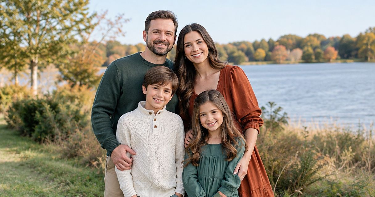
Best overall: navy, cream, and tan. Best for a soft outdoor look: sage, cream, and taupe. Best for autumn warmth: rust, oatmeal, and brown. The best outfit colors for family portraits create a connection between your clothes without making everyone look identical; these combinations give you a clear starting point for your 2026 session.
TL;DR
- The best outfit colors for family portraits start with navy, cream, and tan for an adaptable, coordinated look.
- Choose sage and cream for softness, rust and oatmeal for warmth, or burgundy and charcoal for depth.
- Coordinate family photo outfits through shared colors, not identical shirts.
- Creativewillsphoto offers family portrait sessions in Rochester and across Southeast Minnesota.
Why this matters
Your clothes share the frame with faces, hands, and the setting. A coordinated palette keeps the photograph from feeling like several unrelated outfits gathered in one place. The aim is connection, not a uniform.
Start with the setting before choosing shirts. A pale outfit against a pale wall creates a different effect from the same outfit against dark trees. Use the best family portrait locations in Rochester, MN to think about your background before you settle on a palette.
For families planning portraits in Rochester and Southeast Minnesota, Creativewillsphoto offers a local family-session option. Choose your clothing around the people and place, rather than a look that only works on a shopping page.
What makes the best outfit colors for family portraits?
Judge each combination against these criteria before choosing a favorite:
- Faces first: Notice whether you look at expressions or a bright shirt first. Give faces priority.
- Background contrast: Choose enough difference between clothing and surroundings to keep people visually distinct.
- Shared undertones: Repeat a warm or cool direction across outfits instead of mixing unrelated shades accidentally.
- Light and dark: Include some variation in depth so the group does not become one flat block of color.
- Wearable choices: Start with clothes that fit comfortably and feel familiar. A pleasing palette cannot fix an uncomfortable outfit.
These criteria also explain why matching every shirt is unnecessary. You can repeat cream in a sweater, a dress detail, and a child's shirt while letting each person wear a different main color.
Family portrait colors at a glance
| Palette | Best for | Standout feature | Key limitation | |---|---|---|---| | Navy, cream, and tan | An adaptable starting point | Balances a deep color with light neutrals | Too much navy makes the group visually dark | | Sage, cream, and taupe | A soft outdoor look | Creates a restrained, muted combination | Sage can blend into a green background | | Rust, oatmeal, and brown | Autumn warmth | Repeats warm, earthy tones | Rust can disappear against orange foliage | | Dusty blue, gray, and cream | A cool, understated look | Combines gentle blues with neutral layers | Similar pale shades can lack separation | | Burgundy, charcoal, and cream | A dressed-up portrait | Adds depth without an all-black palette | Dark garments can merge together | | Black, ivory, and denim | Reusing familiar wardrobe pieces | Builds around common clothing staples | Strong contrast can dominate the photograph |
Think of your family palette as a direction, not a requirement to buy every color listed. Choose the combination that suits your setting, then distribute its colors unevenly across the group.
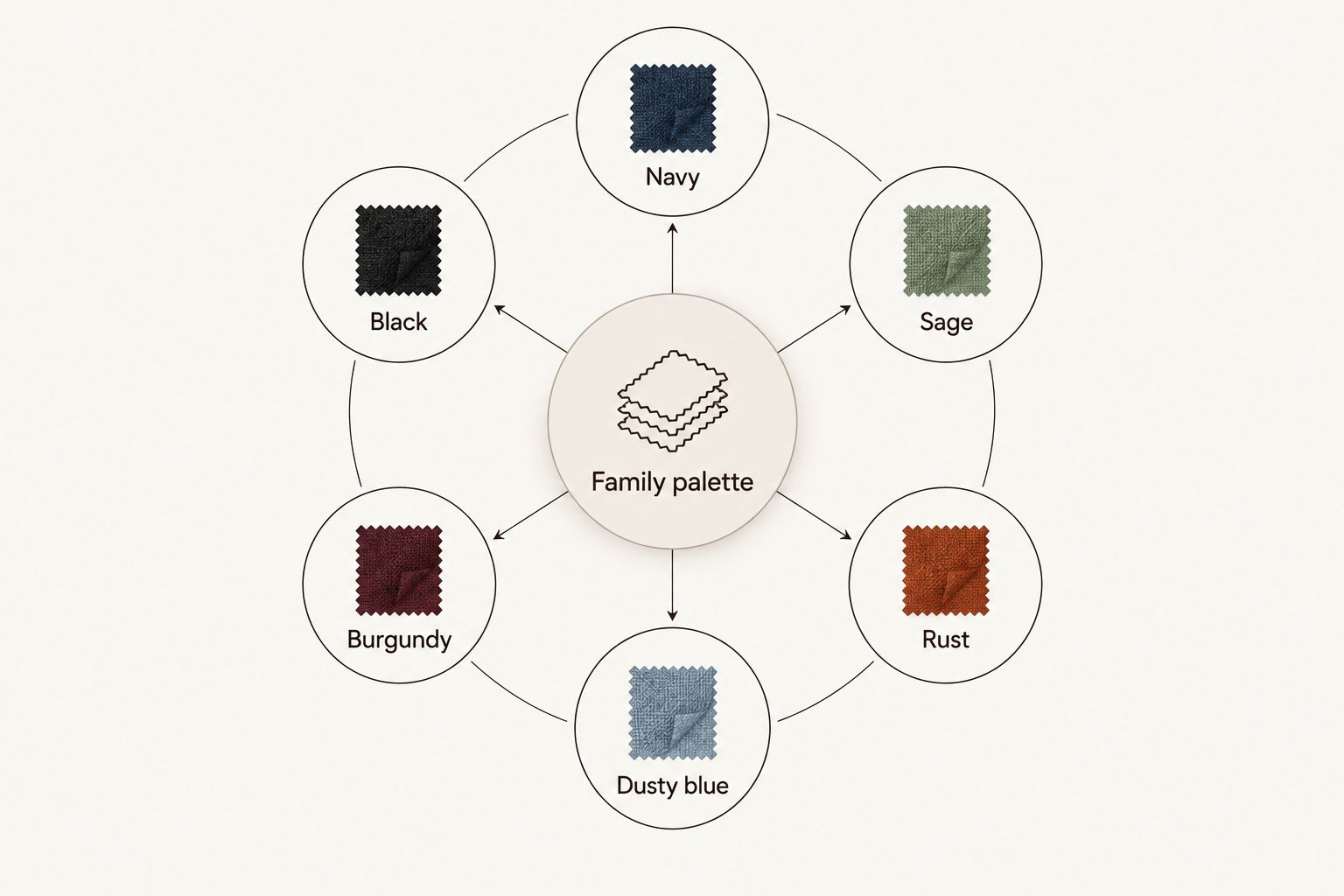
Choose a main color direction, then connect the outfits with supporting neutrals.
1. Navy, cream, and tan: best for an adaptable starting point
Navy supplies depth, cream introduces light, and tan connects the two. This combination gives you a straightforward way to coordinate different garments without asking everyone to wear the same shade.
For a 2026 family session, try a cream knit with tan trousers on one person and a navy dress or shirt on another. Let a smaller detail repeat a color elsewhere rather than assigning every person all three colors.
Navy, cream, and tan pros:
- Gives light and dark clothing clear roles.
- Works with both relaxed and more formal outfit choices.
- Lets you repeat neutral colors without identical outfits.
Navy, cream, and tan cons:
- Navy-heavy outfits can form a large dark area.
- Different creams can look noticeably yellow or pink beside one another.
Best for: Families who want a clear default before considering more seasonal colors.
Verdict: Choose navy, cream, and tan when you want the simplest starting point.
2. Sage, cream, and taupe: best for a soft outdoor look
Sage brings color without the intensity of a vivid green. Cream and taupe keep the combination quiet, making this a useful direction when you want clothing to feel gentle rather than graphic.
Check the actual green against your location. A sage shirt that looks distinct indoors can look much closer to surrounding grass or leaves outside; move some family members into cream or taupe to break up that repetition.
Sage, cream, and taupe pros:
- Offers color without a bright accent.
- Allows subtle differences between individual outfits.
- Suits a relaxed approach to dresses, knits, and separates.
Sage, cream, and taupe cons:
- Green clothing can blend into green surroundings.
- Warm taupe and very cool sage need a side-by-side check.
Best for: Families who prefer muted outdoor portraits over strong contrast.
Verdict: Choose sage, cream, and taupe for softness; skip an all-sage group against greenery.
3. Rust, oatmeal, and brown: best for autumn warmth
Rust, oatmeal, and brown share a warm direction. The combination feels connected without relying on one exact fabric or matching garment.
For autumn portraits in 2026, use rust as an accent rather than covering the whole family in it. An oatmeal sweater beside brown trousers gives the eye a pause, particularly when the setting already contains orange or reddish leaves.
Rust, oatmeal, and brown pros:
- Creates a consistent warm palette.
- Gives textured knits and simple separates a shared direction.
- Offers a clear alternative to blue-based combinations.
Rust, oatmeal, and brown cons:
- Rust can compete with or blend into autumn foliage.
- Several similar browns can make individual outfits hard to distinguish.
Best for: Families who want warm clothing colors and are willing to account for the background.
Verdict: Choose rust, oatmeal, and brown for warmth; keep the strongest orange tone limited.
4. Dusty blue, gray, and cream: best for a cool, understated look
Dusty blue introduces a softer blue than navy. Gray supports that cool direction, while cream keeps the combination from becoming entirely blue-gray.
Build in a difference in depth. If every garment is equally pale, the outfits can lose definition beside each other; a medium-gray layer or a deeper blue piece gives the group more separation.
Dusty blue, gray, and cream pros:
- Creates a restrained alternative to darker blue outfits.
- Allows different people to wear different blue shades.
- Pairs color with simple neutral clothing.
Dusty blue, gray, and cream cons:
- Pale shades can blend together.
- A strongly yellow cream can interrupt the cooler palette.
Best for: Families who like blue but do not want navy to dominate.
Verdict: Choose dusty blue, gray, and cream when you want a cool palette with visible light-and-dark variation.
5. Burgundy, charcoal, and cream: best for a dressed-up portrait
Burgundy brings a deeper red into the frame without using a bright primary red. Charcoal adds another dark tone, and cream provides the contrast that keeps the combination readable.
For a dressed-up 2026 portrait, give burgundy one clear role: a dress, a sweater, or another main garment. Avoid making every outfit dark from shoulder to shoe, especially when family members will stand close together.
Burgundy, charcoal, and cream pros:
- Creates a more dramatic color direction.
- Separates a red accent from neutral supporting pieces.
- Gives cream a useful role between deeper shades.
Burgundy, charcoal, and cream cons:
- Burgundy and charcoal can merge in shadow.
- A large burgundy garment can become the strongest visual element.
Best for: Families who want a more formal-looking palette without matching black outfits.
Verdict: Choose burgundy, charcoal, and cream for depth; preserve enough light clothing to balance it.
6. Black, ivory, and denim: best for familiar wardrobe pieces
Black, ivory, and denim give you a practical place to start when you want to use clothes you already wear. Denim also allows some variation in blue without introducing an entirely separate color direction.
Set the formality deliberately. A casual denim shirt and a sharply tailored black outfit can feel disconnected even when their colors coordinate; compare the whole outfit, not just its shade.
Black, ivory, and denim pros:
- Starts with recognizable wardrobe staples.
- Allows relaxed clothing without a fully matching look.
- Creates clear contrast between light and dark pieces.
Black, ivory, and denim cons:
- Large black-and-ivory blocks can pull attention from faces.
- Very different denim washes can make the group feel less coordinated.
Best for: Families who want to begin with familiar clothes rather than build around a new seasonal palette.
Verdict: Choose black, ivory, and denim for familiarity; skip it if the contrast feels louder than the people.
How these palettes are ranked
Navy, cream, and tan ranks first because it gives each part of the outfit a clear job: depth, light, and connection. The remaining palettes serve distinct preferences rather than represent a universal order of quality.
This is a styling guide, not a measured performance test. The ranking follows the criteria above: faces first, background contrast, shared undertones, light-and-dark variation, and clothes you can comfortably wear.
Turn your palette into actual outfits
Use this sequence before your 2026 session. It is easier to adjust clothes at home than discover a clash when everyone is dressed.
- Choose one anchor garment. Start with a piece someone genuinely wants to wear, then borrow its colors for the other outfits.
- Limit the main palette to 3 colors. Treat this as a simplifying rule, not a requirement to match every detail.
- Lay everything together. Include shoes, outer layers, and visible socks so you see the whole group.
- Check the clothes in daylight. Compare undertones and make sure light garments are not unexpectedly sheer.
- Take 1 phone photo. Use it to spot a dominant pattern, a disconnected color, or a missing light or dark element.
- Practise sitting and moving. Let children bend, walk, and sit in their clothes before deciding the outfits are finished.
If you introduce a pattern, start with just 1 patterned garment and repeat one of its colors elsewhere. Add more only when the group still looks connected. The goal is fewer competing ideas, not a rule against personality.
Which family portrait colors should you choose?
Choose navy, cream, and tan if you are undecided. Switch to sage for softness, rust for warmth, dusty blue for a cooler look, burgundy for depth, or black and denim for familiar wardrobe pieces.
Then stop comparing palettes and look at your own clothes together. For a local session, Creativewillsphoto offers family photography in Rochester and across Southeast Minnesota; your final outfit choices should still reflect your family rather than a prescribed uniform.
FAQ
What are the best outfit colors for family portraits?
Navy, cream, and tan are the strongest default recommendation in this guide. They combine a deep color with light neutrals while allowing each family member to wear a different outfit.
Should everyone wear the same color for family photos?
No. Coordinate a shared palette instead of requiring identical shirts, and repeat selected colors across different garments.
Is white or cream better for family portraits?
Choose the shade that works with the rest of your outfits. Cream supports a warmer palette, while a cooler white needs a side-by-side check with warm tan or oatmeal clothing.
Can we wear black in family portraits?
Yes, black can be part of a coordinated family portrait palette. Balance it with lighter clothing if you do not want the group to become one large dark shape.
What colors should we wear for fall family pictures?
Rust, oatmeal, and brown are a warm starting point for fall family pictures. Limit rust when the background already contains strong orange foliage.
Can one person wear a pattern in family photos?
Yes, one patterned garment can connect the outfits. Repeat a color from that pattern in other family members' clothing, then check that the pattern does not dominate.
How do we choose colors for a 2026 family portrait session?
Choose your setting first, then compare a shared palette against that background. Lay the complete outfits together and check comfort before committing.
One last thing
Put the coats in the outfit check, too. If an outer layer will appear in your photographs, it belongs in the palette from the beginning—not as an afterthought when everyone steps outside.
For your 2026 portraits, make one final decision with the whole family dressed: do the clothes let you notice the people first? Keep the pieces that do. Change the one that interrupts.